水彩杂志风 Watercolor Editorial
绘画washmagazineloosepigment
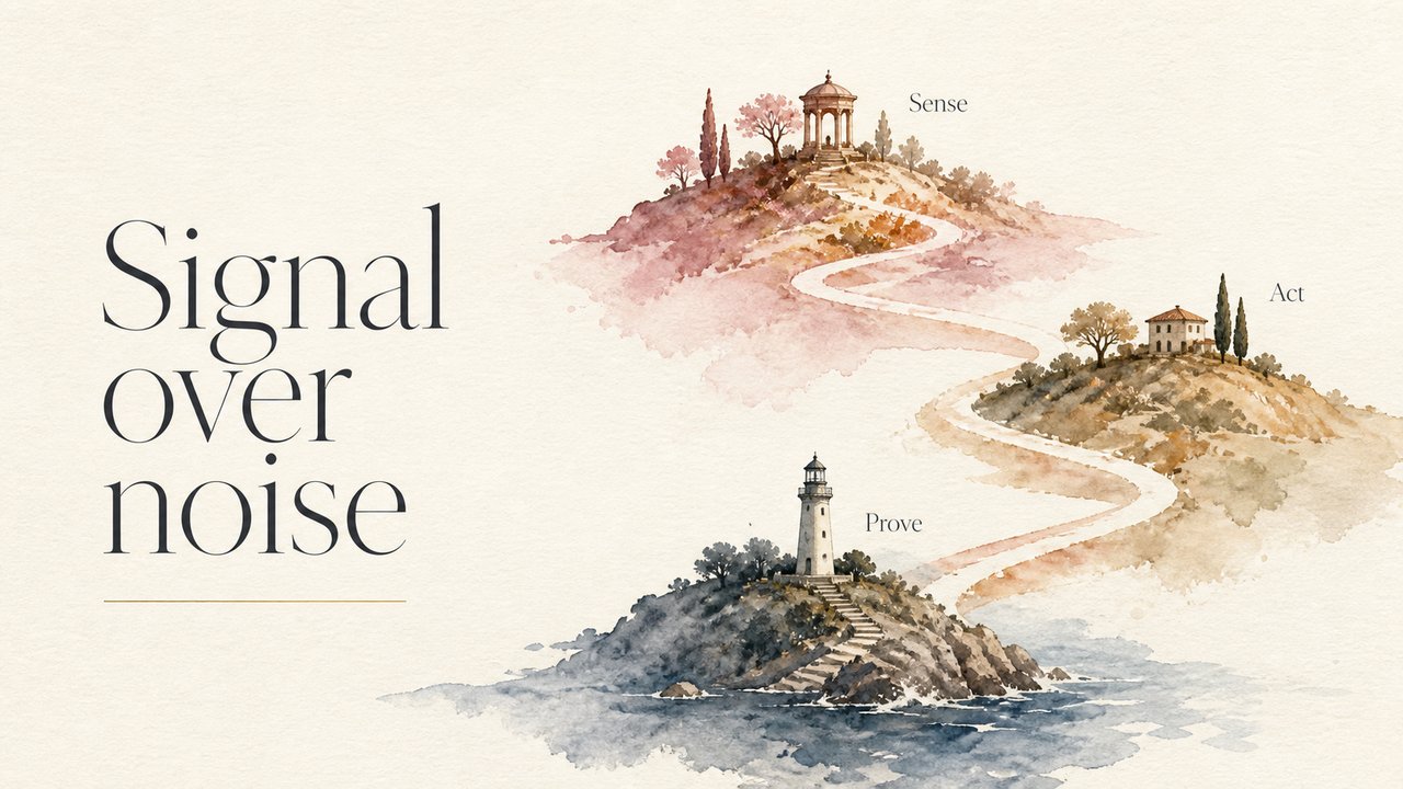
松弛的水彩晕染——印刷杂志跨页般的温度。
样张统一渲染同一句话——Signal over noise——因此材质是唯一变量。
Prompt 配方
配方保留英文原文——它是直接喂给图像模型的指令,翻译会破坏可复现性。
SURFACE:  Warm off-white cotton-paper background. The hero is a loose, confident watercolor illustration — a landscape of three softly-painted hills/islands connected by a winding watercolor path, pigment blooms and granulation visible, colors bleeding naturally at edges - dusty rose, ochre, slate blue with generous white paper reserved. Each island holds a tiny painted landmark; its label appears in refined small serif ONLY when the page's TEXT provides one. Asymmetric editorial layout - the page's TEXT set in large elegant thin serif on the left third with lots of air, a thin hairline rule, any subtitle letter-spaced. Feels like a premium lifestyle magazine opening spread — artistic, breathing, sophisticated.
SKELETON: auto by page role (cover / chapter / list / compare)
DEVICE:   the page's argument drawn as a form native to this material
END:      Full-bleed 16:9 — render DEVICE on the SURFACE, per the page's composition.
CRITICAL: title = the page's TEXT in its own language, clean and legible; NEVER invent words or glyphs beyond TEXT;
annotations only as marks / numbers / dimension lines; no UI, no cards, no captions.
来源
材质配方出自 PPT-Zen 32 材质库。画面为我们自绘。
许可证:CC-BY-4.0 · 贡献走 DCO