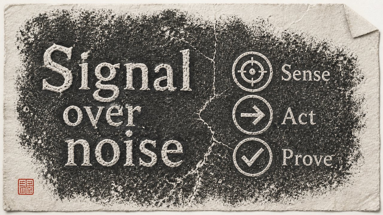
碑拓 Stele Rubbing
拓片black-groundcarvedepigraphserious
碑拓——黑底上的白色刻字;正经场合的标题风格。
样张统一渲染同一句话——Signal over noise——因此材质是唯一变量。
Prompt 配方
配方保留英文原文——它是直接喂给图像模型的指令,翻译会破坏可复现性。
SURFACE:  A hand-taken ink rubbing - damp paper was pressed onto a carved stone stele and tamped with an ink pad, so the carved recesses stay PAPER-WHITE and everything else is a dense charcoal-black field. The tell of a real rubbing must be everywhere — the ink is not flat - it is built from countless tiny tamping dabs, denser in the middle and thinning toward the edges; the stone's natural pitting, weathering scars and a crack or two come through as pale mottling and irregular white speckles; the paper shows soft creases, fibre texture, slightly torn deckle edges and one dog-eared corner. The page's TEXT reads as stone-carved forms — clerical/seal script energy with blunt chiselled terminals, NOT brush-written. Palette strictly monochrome - charcoal-black ink, warm off-white paper, and one small vermilion collector's seal as the ONLY colour in the image.
SKELETON: auto by page role (cover / chapter / list / compare)
DEVICE:   the page's argument drawn as a form native to this material
END:      Full-bleed 16:9 — render DEVICE on the SURFACE, per the page's composition.
CRITICAL: title = the page's TEXT in its own language, clean and legible; NEVER invent words or glyphs beyond TEXT;
annotations only as marks / numbers / dimension lines; no UI, no cards, no captions.
来源
材质配方出自 PPT-Zen 32 材质库。画面为我们自绘。
许可证:CC-BY-4.0 · 贡献走 DCO